Creating one provider experience across 20+ sites.
When more than 20 Medicaid provider websites needed to move from an outdated CMS, the migration created an opportunity to solve a larger problem: inconsistent architectures, outdated designs and information that was difficult for providers to find.
I led the UX work to create a shared information architecture and flexible design system that could support multiple brands while giving providers a more consistent, intuitive experience.
20+ Sites
Unified around one structure
40+ Pages
Organized around provider needs
My Role
UX Lead • Information Architect • Visual Design
Collaborators
UX Team · Content Team · Developers · Provider Relations
Domain
Medicaid · Provider Experience
YEAR
2017
The challenge
More than 20 Medicaid provider websites had evolved with different structures, designs and ways of organizing information. Providers often struggled to find what they needed, while the lack of consistency made the sites difficult for internal teams to maintain.
Our goal
Use the CMS migration as an opportunity to create a better provider experience, not simply move existing content. We needed a shared structure that made information easier to find while supporting the needs and identities of multiple Medicaid brands.
The outcome
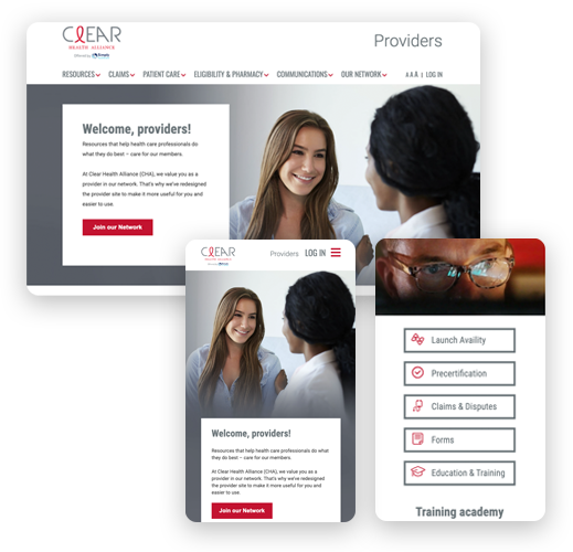
We created a common information architecture and flexible design system that brought consistency to 20+ provider sites. Reusable components made the experience easier to scale and maintain while allowing each Medicaid brand to retain its own visual identity.
The approach
We used the CMS migration as an opportunity to rethink the provider experience rather than simply move existing content. Research, analytics and stakeholder input helped us understand how providers used the sites, which information mattered most and where the existing experience created friction.
From there, we developed a shared information architecture and reusable design patterns that could bring consistency across more than 20 provider sites while still allowing each Medicaid brand to maintain its own visual identity.
UNDERSTAND PROVIDER NEEDS
Used surveys, analytics, stakeholder input and existing research to understand how providers used the sites and where they struggled.
PRIORITIZE TOP TASKS
Identified the information and tools providers used most often and gave those tasks greater prominence within the experience.
CREATE A SHARED ARCHITECTURE
Developed a common information architecture for 40+ content-heavy pages, using clearer categories, labels and pathways.
DESIGN FOR SCALE
Created reusable components and patterns that could support 20+ sites while adapting to the visual identity of each Medicaid brand.
The solution
Make the important things easier to find
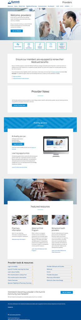
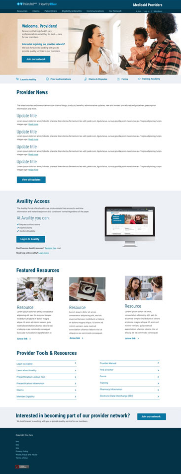
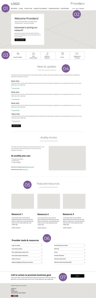
The redesigned experience organized provider information around recognizable categories and gave high-priority tasks greater visibility. Frequently used tools remained available throughout the site, while contextual links connected related information so providers didn’t have to understand the site’s architecture to find what they needed.
Navigation based on priority
Usage data informed the hierarchy, putting frequently used content—like Forms—where providers could reach it quickly.
Persistent access to Availity
Login remained available in the top navigation, giving providers consistent access to the transactions they relied on to conduct business with the health plan.
Quick access to common tasks
High-use destinations were surfaced as shortcuts immediately below the hero, giving providers another direct path to things like claims, authorizations, forms and training.
Provider news brought forward
Timely provider updates were given prominent homepage placement instead of being buried deeper within the site.
Key resources made prominent
Frequently used resources were surfaced directly on the homepage, giving providers quick access to important information without requiring them to navigate deeper into the site.
Common tools within reach
High-use tools were available consistently across the site, allowing providers to quickly reach the resources they relied on regardless of where they were in the experience.
Support business goals
A prominent call to action near the end of each page highlighted a key next step and encouraged providers to take action.
Plain language navigation
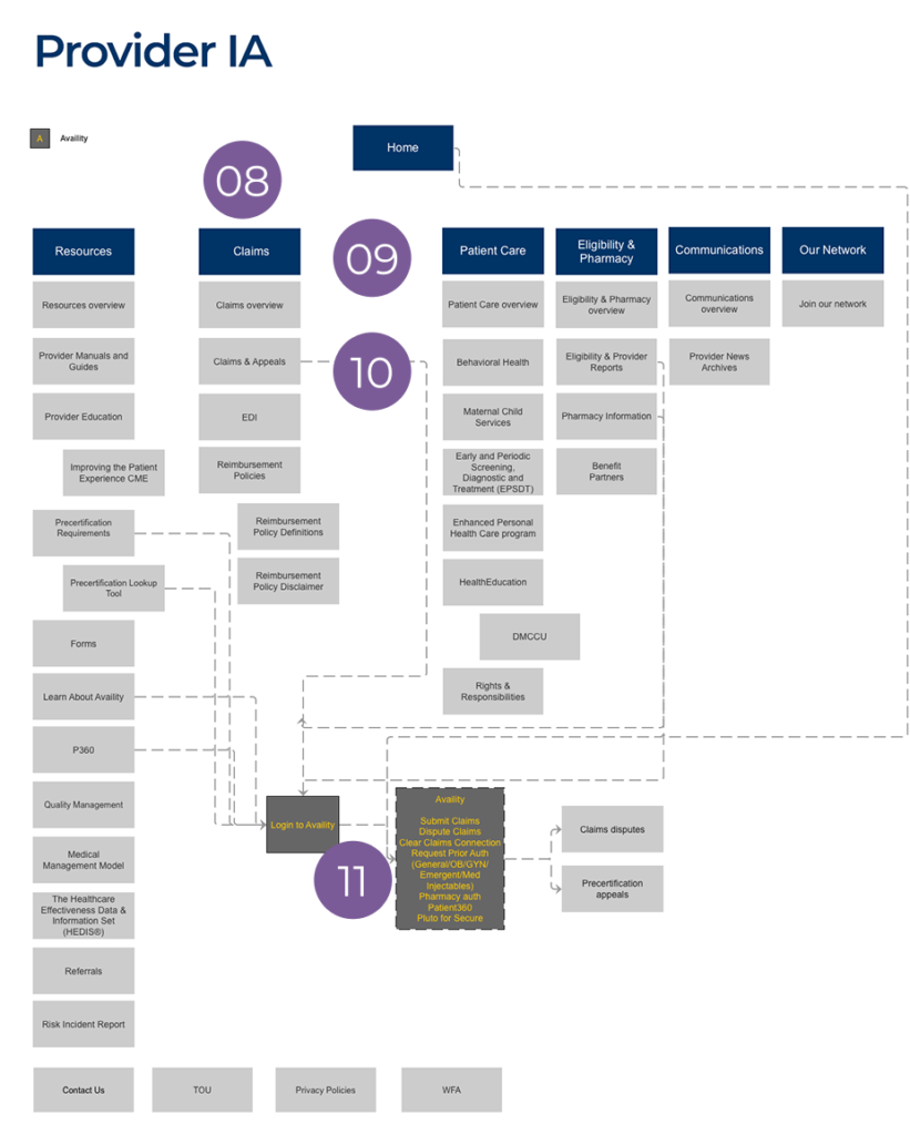
Clear labels helped providers anticipate what they would find within each section.
Related content grouped together
More than 40 pages were organized into logical categories based on provider needs rather than internal organizational structure.
Hierarchy informed by usage
Usage data helped determine not only the top-level navigation, but the order and prominence of content within each section.
Availity integrated into the experience
Transactions completed in Availity were linked directly from relevant site content, connecting the information providers needed with the tools they used to complete their work.
Designing a system, not a single site
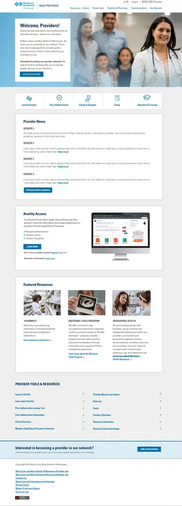
The solution needed to work across more than 20 Medicaid provider sites, each with its own brand identity. We created reusable components and patterns that established a consistent experience while allowing colors, typography and other brand elements to adapt by market.
The result was a shared foundation that gave providers a more consistent experience across Medicaid markets while making the sites easier for internal teams to maintain and scale.