Making Medicaid enrollment easier
After Medicaid expansion, many people were navigating Medicaid enrollment for the first time. State websites were often difficult to navigate and filled with unfamiliar terminology, leaving people unsure whether they qualified, what their options were or how to apply.
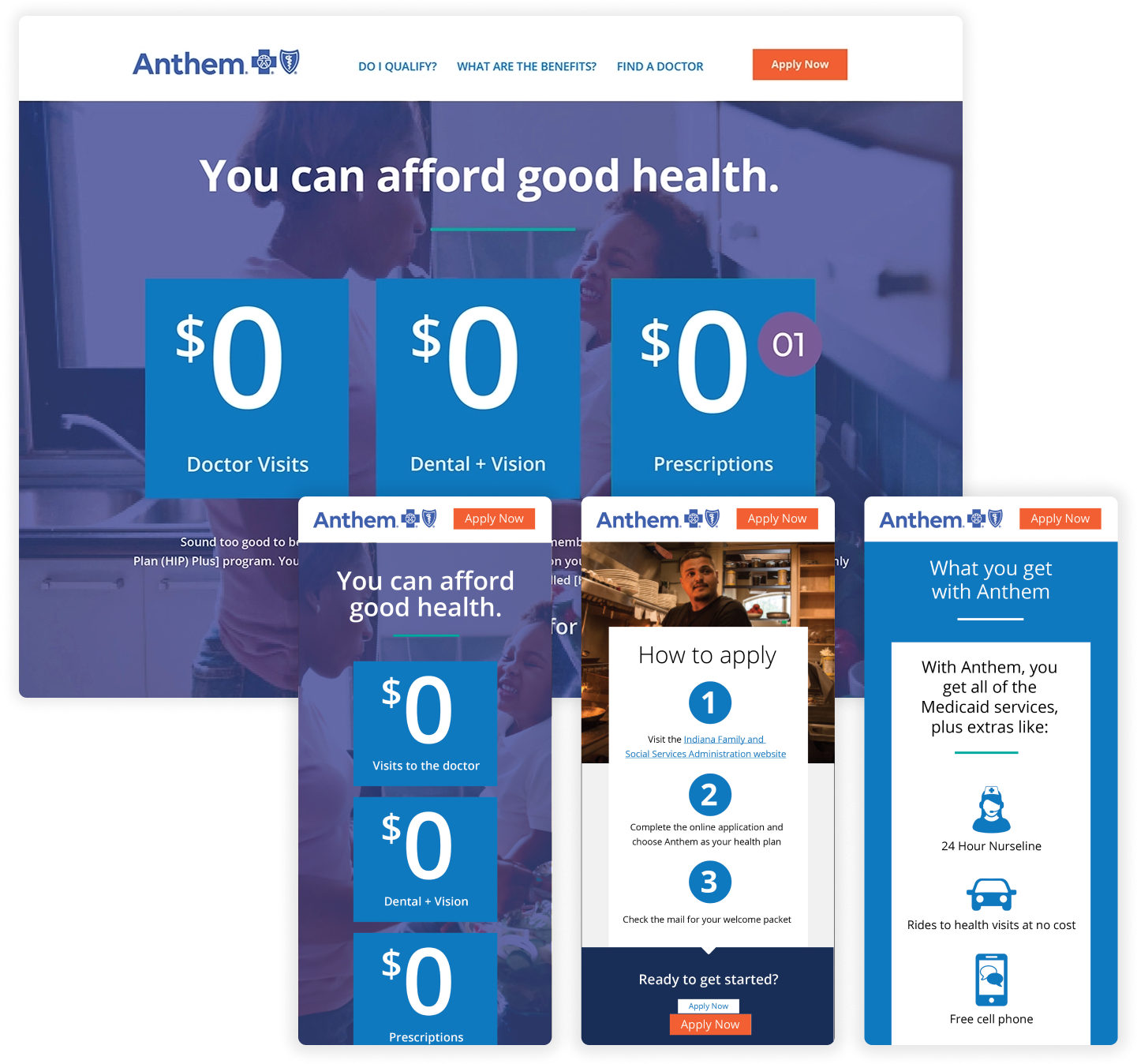
I worked with the content team to create a focused microsite that made the process easier to understand and helped people confidently take the next step.
A Clear Path
through Medicaid enrollment
Simple Steps
to find out if you’re eligible and get covered.
My Role
UX & Visual Designer
Collaborators
Content writer • Marketing Director • Developer
Domain
Medicaid · Enrollment · Member Experience
The challenge
Medicaid enrollment was already complicated. For newly eligible members, confusing navigation, dense information and unfamiliar terminology created even more barriers.
People needed answers to some very basic questions: Do I qualify? What benefits are available? How do I choose a plan? And what do I need to do next?
Our goal
To create a simpler path through the enrollment process by giving potential members clear, accessible information at the moment they needed it, without requiring them to navigate through the complexity of a full health plan or state website.
The concept
The microsite brought essential enrollment information into one focused, easy-to-navigate experience, using plain language and clear pathways to help people understand eligibility, benefits, plan choices and how to apply.
The approach
UNDERSTAND WHERE IT GETS CONFUSING
Identified the questions potential members needed answered before they could confidently move forward with enrollment.
SIMPLIFY INFORMATION
Worked with content partners to translate complex Medicaid information and terminology into clear, understandable content.
CREATE A CLEAR PATH
Organized eligibility, benefits, plan information and application steps in the order people needed to understand and act on them.
REMOVE BARRIERS
Created a responsive, accessible experience that made important information easier to find and understand across devices.
The solution
A focused experience for a complicated process
Rather than asking potential members to navigate a large health plan website, the microsite concentrated the information needed for enrollment into a smaller, purpose-built experience.
Clear navigation and plain-language content helped answer the questions people were likely to have along the way, from understanding eligibility and benefits to comparing their options and knowing how to apply.
Start with what matters most
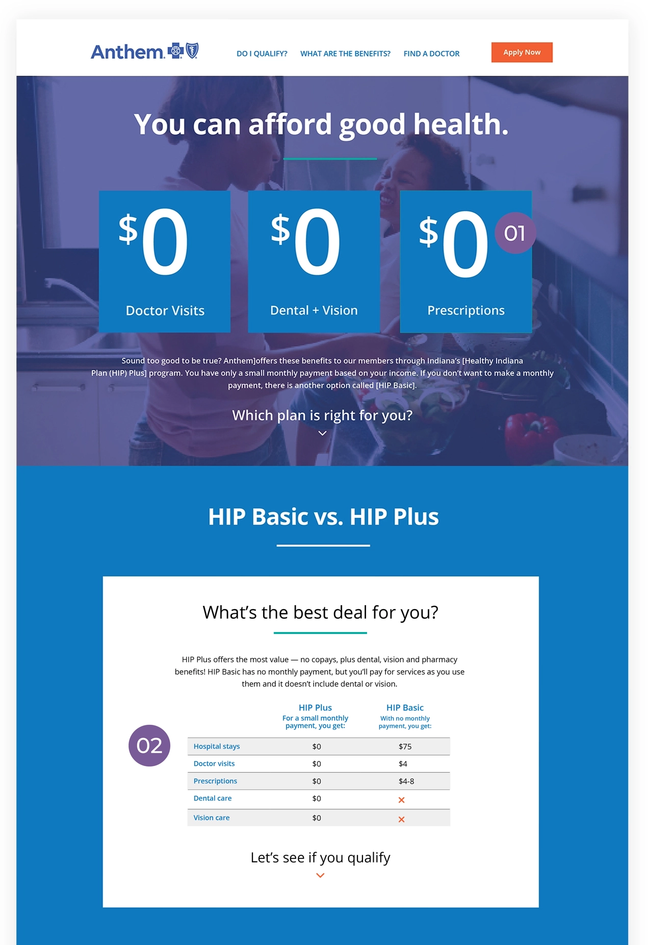
Put the most important question front and center: Can I afford health coverage? The $0 messaging immediately communicates that some important Medicaid benefits have no copay.
Make plan differences easier to understand
A simple comparison helps people understand their options without requiring them to decipher insurance terminology or hunt through multiple pages.
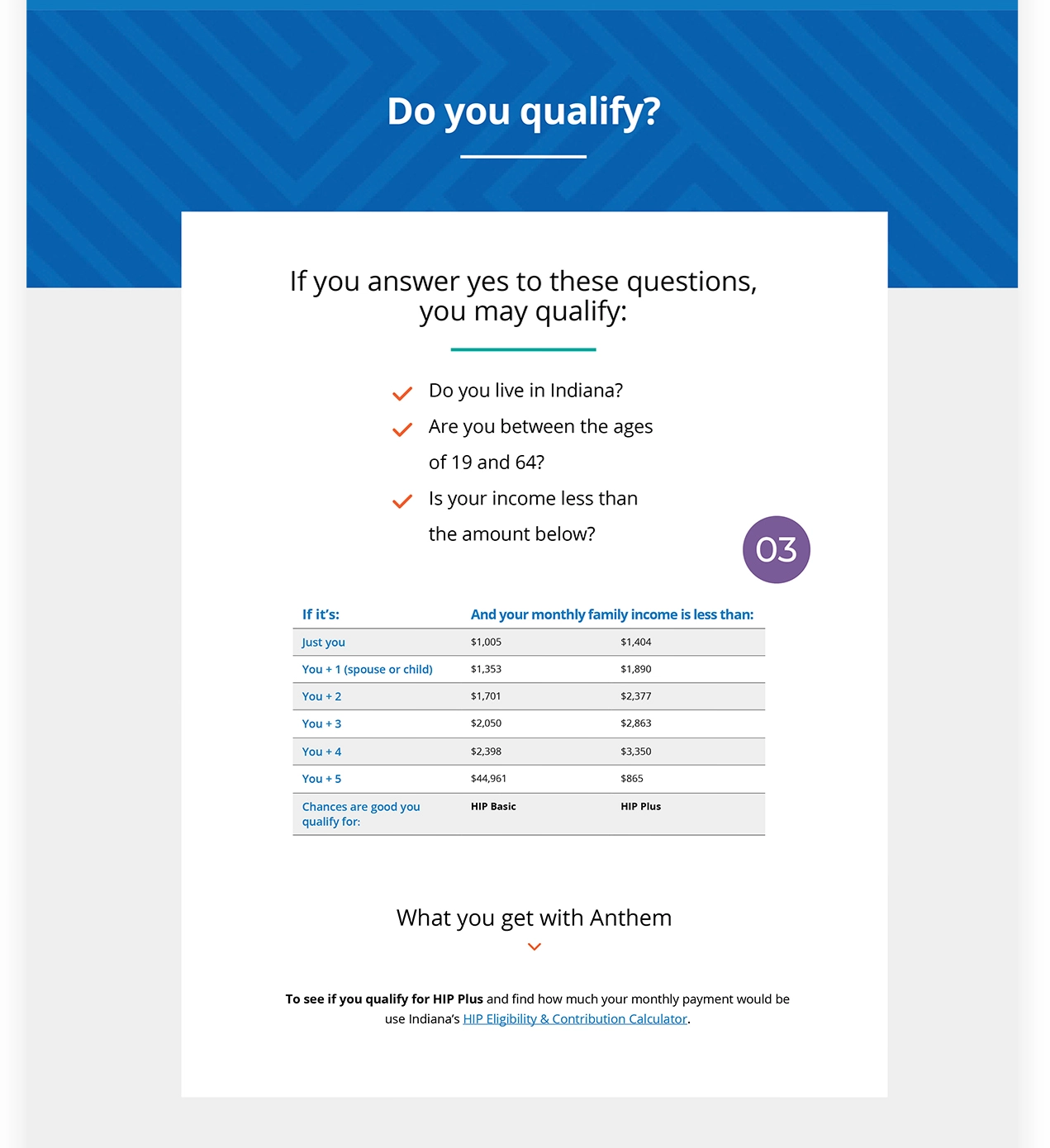
Help people determine eligibility
Eligibility information is brought directly into the experience, helping users understand whether they may qualify and what factors affect their options.
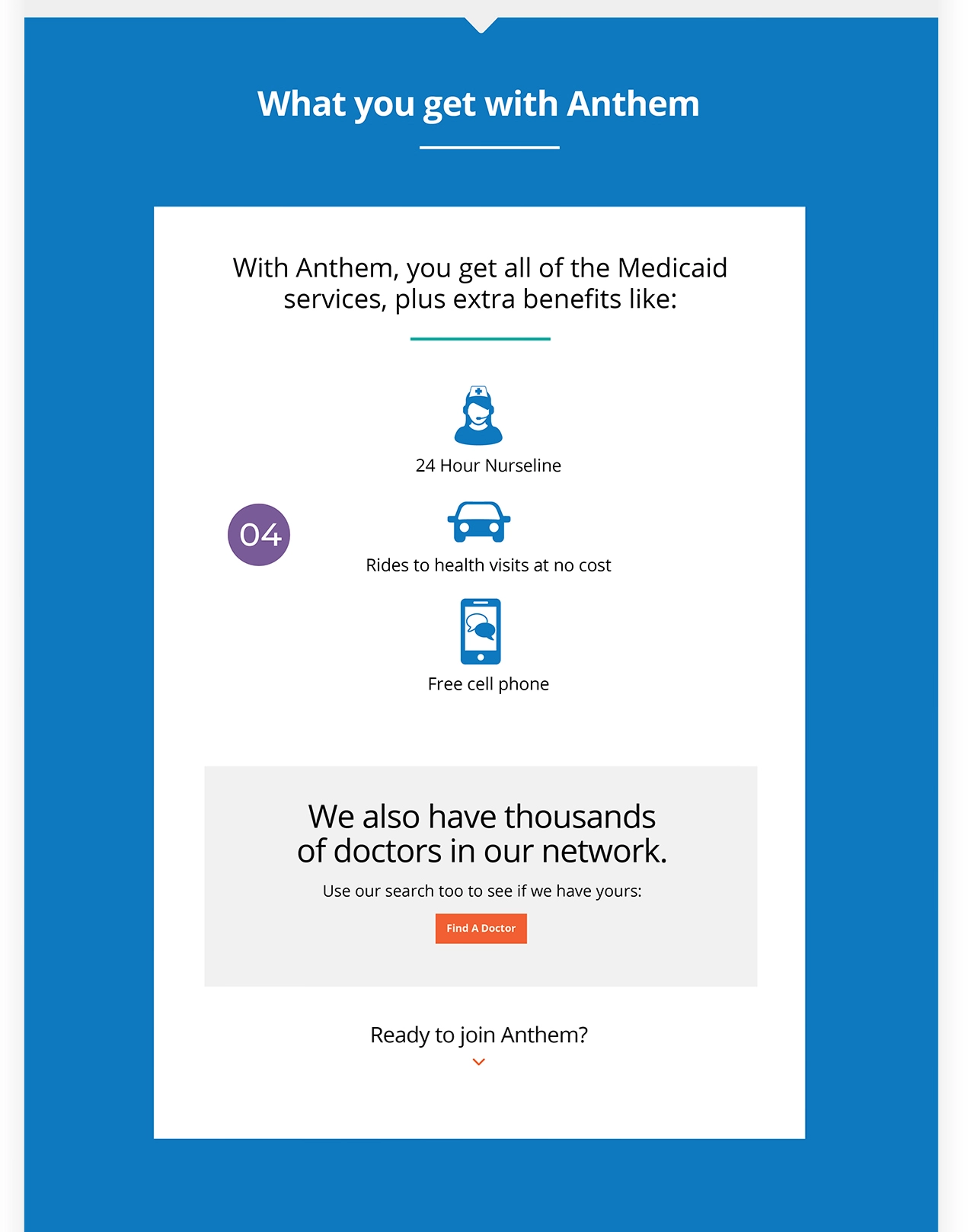
Show the value of coverage
Benefits are explained in practical terms, helping potential members understand what Medicaid coverage includes—not just whether they qualify.
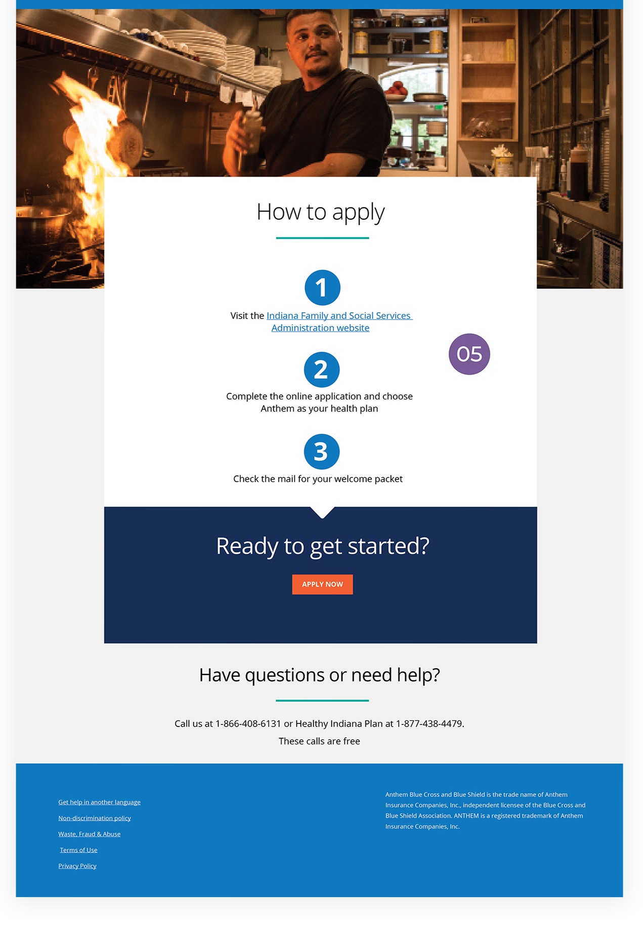
Turn information into action
A simple three-step path gives users a clear way forward once they’re ready to enroll, reducing uncertainty about what happens next.